Scalable landing pages using Contentful and Storybook

Alyssa Mitchell
April 26, 2023

Note: this article was originally published on September 7th, 2022 on Medium.com when I was an in-house frontend engineer at Curology. The content is relevant to what I'm doing at Cosite, so I wanted to reshare it. Enjoy :)
As Curology has grown and launched new products, there’s a need to reach new audiences. One of the main ways we do this is through targeted landing pages. There are a lot of hands involved in building and launching a landing page — marketing, design, engineering, copy, and legal. It is no small feat.
Up until two months ago, all of our landing pages had to be built using code. Today, no code is needed. How did we get to where we are today and what did we learn along the way? This is the story.
So many pain points
Three months ago, if someone in marketing wanted a landing page, it took at least one month from the time they brought up the request to launch. There were many pain points with the system we were using, the biggest being that it wasn’t scalable to keep up with the increasing amount of landing pages our team needed.
Some of the other pain points you might be able to relate to if you’ve ever worked in growth:
- Time-consuming process — It was time-consuming to build new landing pages, even when they were templatized. From conception to launch, it could take anywhere from two weeks to two months before a landing page was launched.
- Small tweaks add up—Any change required lots of back-and-forth between cross-functional teams. For instance, if we wanted to make a simple copy change, a copy editor would write the copy, a designer would update the mockup, and then an engineer would update the code. Rinse and repeat.
- Repetitive work — For designers and engineers, in particular, building a landing page became mostly copy-and-paste and wasn’t utilizing their skills to their fullest potential.
- Limited bandwidth — No team has an endless supply of people to build landing pages and Curology is no different. We’ve had to deprioritize or say no to some landing pages entirely.
- Unclear flexibility — Everyone was confused over what parts of our existing pages and modules were flexible and which design changes would require a lot of coding work.
As an engineer on the team responsible for our site and building these landing pages, I knew we could fix these pain points. We had been using Contentful for our blog and skincare guides for over a year and I was sure that we could use it for landing pages as well.
I teamed up with Sierra, a designer on the team, to tackle these problems and build a scalable solution.
Our no-code solution
Our site uses a component-based design. Instead of building net new modules each time we need a new landing page, we’ll reuse modules that have already been designed and coded and just swap out the content. With our solution, we wanted to carry this paradigm, used widely in our code, to Contentful.
As we built the solution, we had a few other goals in mind:
- User-friendly interface — we wanted our CMS to be easy-to-use for non-tech people.
- Easy to add new modules — we identified four modules users could choose from to start with, but we wanted to make sure it would be easy to add new modules in the future.
- No coding needed — we wanted to eliminate the need for engineering involvement.
- Flexible but not too flexible — we wanted it to be flexible enough so our marketing teams could build landing pages according to their needs, but we didn’t want it to be so flexible that they would have to become designers in the process.
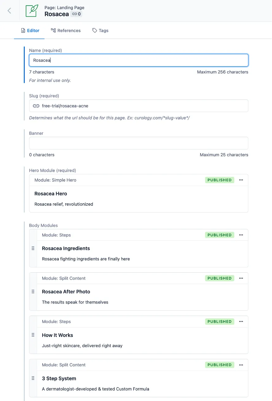
The Contentful user interface we came up with contained the following fields: name, slug, banner, hero module, body modules, and SEO details (e.g. the meta title and meta description).

The Contentful user interface to build a new landing page 🖼
For each module, we needed to identify which elements were flexible. Most of the flexibility we decided to allow was around the content itself — swapping out copy and images. We also added controls so that small design changes could be made to the module’s background color or layout.
The result was a flexible system that allows our marketing team to build on-brand landing pages in record time.
The icing on the cake
We utilized thoughtful design as we built out scalable landing pages and spent time adding some extra features that make the system even easier to use. Three, in particular, stand out.
Integration with our site design system.

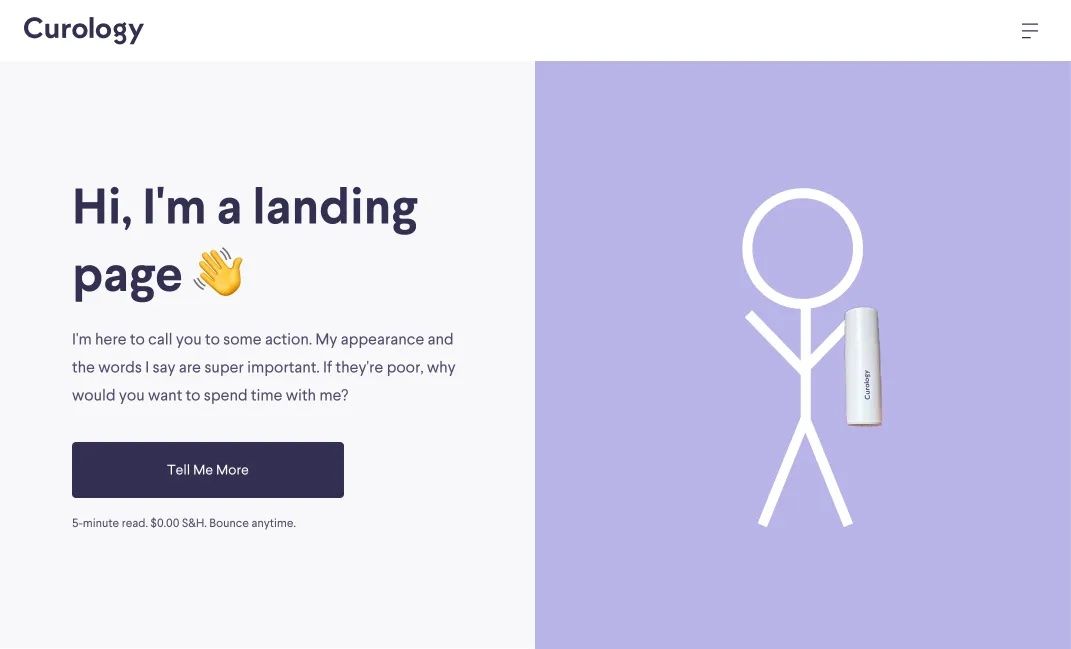
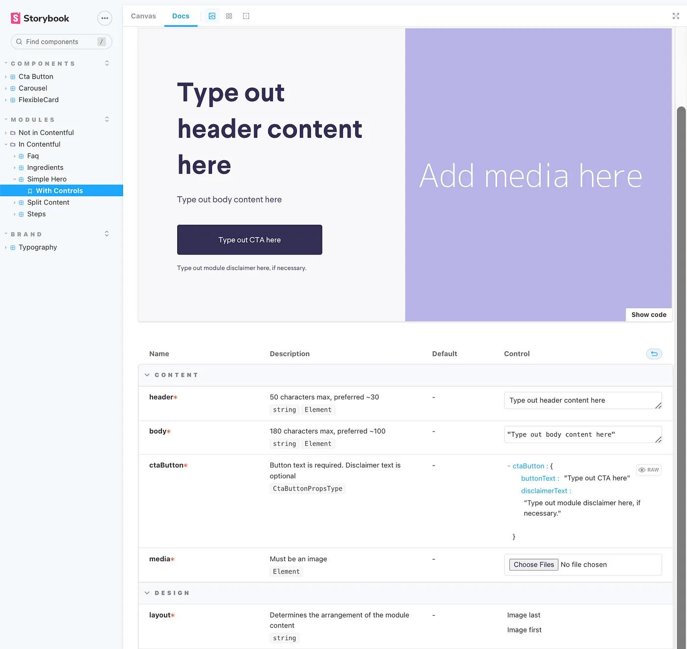
An example of a module in Curology’s site design system ✨
The Contentful editor is filled with input fields, radio buttons, and no visual representation of how a landing page will look when it’s published. Using it alone, you’re building blind until you fill in the content and hit the preview button.
We use Storybook for our site design system. It’s a great tool that lets us build a component library of our site modules. We decided to integrate the two tools. Before even entering Contentful, our marketing team can use Storybook to browse the available module designs, edit module properties with the content they’re thinking of using, and preview changes immediately.
This also brought the unintended benefit of alignment on field names, character count limits, and image sizes before we even added these modules to Contentful.
Bank of reusable pre-approved modules to choose from.
When marketing adds a module to their page, they can scroll through a list of already-published and legal-approved modules and if they find one that meets their needs, they can reuse it. There’s no need to get new copy or go through a legal review since the module has already been approved.
Contentful Image Focal Point app.
We integrated Contentful’s Image Focal Point app, so anytime someone uploads an image to Contentful, they can specify the focal point of that image. Then, when the image is used on different screen sizes or different modules, it will automatically resize as needed, keeping the focal point always in view. Without this tool, our marketing team would have to make sure their images are a specific size before they upload them to Contentful and sometimes upload multiple images if the image dimensions change between mobile and desktop.
A reflection & looking forwards
We finished building the system in early July and launched with a detailed how-to guide for the team and an hour-long training session.
Check out the pages our team has already built:
Rosacea Acne Landing Page
Dark Spots Landing Page
Courtney Landing Page
This system has changed the way our team works. When marketing requested a new landing page recently, instead of building it the old way using code, we recognized that if we added two modules to Contentful, they could build it themselves. So as an engineer, instead of spending my time pressing CMD+C and CMD+V to build the page, I’m adding those modules to Contentful. This will enable the creation of the requested page now, but also of other landing pages in the future.
The possibilities of what you can do with a CMS are endless. As I worked on this project, I had many ideas of other ways we could enable our teams through Contentful — A/B tests, page redirects, or integrating with Amplitude. Perhaps your brain is buzzing with ideas for your team. If it is, I’d love to hear them!
Thanks for reading,
Alyssa Mitchell